Sid Meier's Civilization (1991)
What it is
Section titled “What it is”Sid Meier’s Civilization (1991) is the original 4X strategy game — a dense, deeply replayable turn-based simulation in which the player guides a civilization from 4000 BCE to a near-future endgame across a map of ~80×50 tiles. The UI is the canonical example of dense DOS-era strategy interface design: a tile-map taking up most of the screen, a tile-state side panel carrying a minimap and current city/unit info, F-key + numeric-keypad shortcuts for unit movement and orders, modal popovers for city management, advisor reports, and tech-tree decisions. The whole experience renders in 16-color VGA at 320×200 (later 320×240) and reads, even today, as remarkably information-dense without feeling cluttered.
Aesthetic / design inspiration for KN-86
Section titled “Aesthetic / design inspiration for KN-86”- Dense information density is a working aesthetic. Civilization 1991 packs an enormous amount of state — minimap, city list, current unit, tech progress, gold + science income, turn counter, advisor queue — into 320×200. The lesson for KN-86 isn’t to mimic the layout (KN-86 is text, not raster) but to commit to information density: a Deckline screen should not be apologizing for being busy. Cross-link to the Batch-1 Gloomberb entry — same lesson, different decade.
- 16-color VGA palette discipline. Civilization used the standard IBM CGA/EGA/VGA 16-color palette and made every color load-bearing — terrain types, unit ownership, city-state, fog of war. KN-86 is monochrome amber so the palette doesn’t transfer directly, but the discipline (every color carries semantic information, no decoration) is the same rule the Batch-2 visual identity brief calls out for KN-86’s intensity-delta-as-semantic rule.
- F-key + numeric-keypad shortcuts for movement and orders. Civilization 1991 leans on the numeric keypad for 8-direction unit movement (
1–9for the eight directions + center). KN-86’s phone-layout numpad (per ADR-0016) doesn’t have the same 1-2-3-bottom-row numeric keypad layout, but the principle — unit/cursor movement via the numeric cluster — is in lineage. Park as a possible cart-authoring pattern for any KN-86 cart that involves a map/tile/grid surface. - Modal popovers for committed decisions. The advisor reports, the city-management screen, the tech-choice dialog — all full-screen modal takeovers from the main map view. KN-86 carts can use the same pattern: take over Rows 1–23 for a focused decision, return to the prior surface on Esc. Inherits the master/detail discipline from golazo at a different scale.
- The minimap is a 3:2-aspect-ratio summary of the main map. KN-86’s CIPHER-LINE OLED (256×64, 4:1) could plausibly carry the same kind of overview-of-the-current-cart-state — a “you are here” summary of whatever the cart’s main surface is doing.
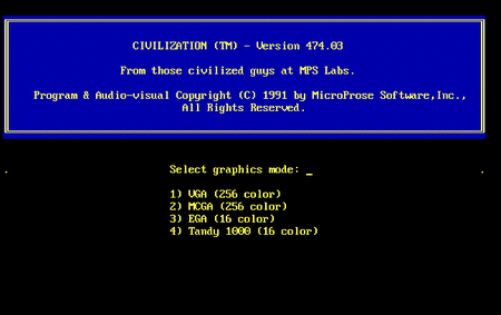
Source: Internet Archive item msdos_Sid_Meiers_Civilization_1991, served at archive.org/serve/.../Sid_Meiers_Civilization_1991_screenshot.gif. Shows the canonical Civ-1 map view — the tile map in the center, the tile-state side panel on the right with minimap up top, and the unit/turn state along the bottom.
- The image is from the Archive’s own item tile, not a fresh run. Per the prompt, we do not download or run the archived software.
- Cross-link gloomberb.md — same density discipline, different decade, different domain.
- The deeper IA lesson is that a strategic-control UI can be both dense and learnable if the visual grammar is consistent: a color = a category, an icon = an entity, a position = a meaning. KN-86 cart authors who target rich-state surfaces should treat Civ 1’s UI as a working precedent — the style is dated, the grammar still works.