Vehicle TUI Concept
Tech stack: N/A — this is a concept render, not a shipped product. License: Unknown — treat as reference-for-inspiration only, do not redistribute.
What it is
Section titled “What it is”A concept image of a car infotainment system rendered as a TUI: title bar at the top (VEHICLE TUI v1.0.0 12:45 P READY 78% 22°C), three top panes (Settings list with > Driver Assistance highlighted, Navigation turn-by-turn instructions, and an ASCII-drawn Map), a bottom row of four small panels (Vehicle Status, Charging, Climate, Media), and a labeled icon nav bar across the bottom ([ Home ] [ Climate ] [ Media ] [ Nav ] [ Phone ] [ Apps ]). The whole thing runs on a dashboard screen inside an actual car.
The reason it’s in this folder isn’t the design itself — it’s that this concept is doing the exact same architectural move KN-86 is doing: a TUI is the product UI of a hardware device, not a window inside a terminal emulator on a general-purpose computer. Everything below treats it as a sibling case study rather than an app to clone.
Aspirational features for KN-86
Section titled “Aspirational features for KN-86”- Row-0-style persistent top status strip.
VEHICLE TUI v1.0.0 12:45 P READY 78% 22°C— product name, version, time, state-flag (Pfor park,READY), battery, ambient temp. This is exactly what Row 0 on KN-86 is for. The concept image validates the pattern: title + a small handful of always-relevant device-state glyphs at the top edge, always present, never overdrawn by content. Worth citing inscreen-design-rules.md. - Row-24-style labeled nav bar at the bottom edge.
[ Home ] [ Climate ] [ Media ] [ Nav ] [ Phone ] [ Apps ]— bracketed labels with a small leading glyph (house / fan / note / arrow / phone / grid). KN-86’s Row 24 should treat this as the reference pattern: short verbs in brackets, optionally with a leading CP437 / planned-Unicode glyph, clearly partitioning the action space. Currently Row 24 is under-specified in screen-design-rules.md compared to Row 0 — this image is a useful target for what “good Row 24” looks like. - Master / detail with explanatory blurb. The Settings pane shows a list (
Driver Assistance,Display,Vehicle,Charging,Connectivity,Sound,Profiles) on the left of the pane, the selected item’s sub-settings (Lane Keeping Assist [ON], etc.) on the right, and a small explanation box underneath (Configure driver assistance systems. ↑/↓ to select a setting. Press Enter to change.). The explanation box is the bit worth stealing — every list-driven KN-86 surface should consider a small “what does this do” panel pinned underneath the focused row. Costs ~3 rows; teaches the operator without an overlay. - Box-drawn map glyph. The Navigation pane includes a tiny ASCII / box-drawing map with the route highlighted and a compass rose. KN-86 cartridges that need spatial visualization (faction territory, dispatch geography, mission map) should treat this as a feasibility proof: meaningful maps in <30 cols × <15 rows are achievable with stock box-drawing.
- Multi-zone dense layout in a fixed pixel envelope. Like KN-86, the concept’s screen is a fixed size — it isn’t going to grow. Every pixel is committed. Compare to PulseDeck/NetWatch, where the terminal can resize: the discipline of “this is the final size, lay it out” is more analogous to the KN-86 case.
- Mode indicator in the status strip (
P READY). Two short state words that tell the operator at a glance “the car is in park, the system is ready.” KN-86’s equivalent: cart-load state (NULL, cart name, mission phase) + runtime-tier state (READY,OFFLINE,LOW BATT). Two slots, always visible.
UX / interaction patterns
Section titled “UX / interaction patterns”↑ / ↓ Navigate,Enter Select,← Back— printed in-band. The Settings pane’s footer literally lists↑/↓: Navigate Enter: Select ←: Back. The bindings are in the UI, not hidden behind?. For KN-86 this is a Row-24 idea — when a surface is keystroke-driven, show the keystrokes on Row 24 rather than expecting recall.- Highlighted-row indicator (
>).> Driver Assistance— leading>glyph marks the focused row. Standard, terse, works in a single column. [ON]toggles. Settings show their state inline (Lane Keeping Assist [ON]). Reads as a status; doubles as the affordance. CP437 brackets render this trivially.- Tab bar by labeled icon, not number. Unlike NetWatch (
1–9digits), this concept uses iconified, named tabs. For KN-86 the digit approach is probably better given the phone-layout numpad — but for the Bare Deck Terminal SYS tab the iconified-bracketed approach is the right model. (Different surfaces, different mental models.)
Visual style
Section titled “Visual style”- Dark cabin-ready theme. Near-black background, single-line box-drawing borders, restrained accent palette (cyan/green/magenta/amber/red). Reads at a glance under varied lighting — exactly what a dashboard at 22°C in any sun condition needs.
- Headers as
:: NAME ::or single-line caps. The concept varies; KN-86 should pick one. (Gloomberb uses:: NAMEleft-aligned — see gloomberb.md. Compatible answer.) - Bracket-glyph labels for every Row-24 action. Square-bracket-enclosed labels, optional leading icon. Reads as “this is a button” without needing a button widget.
- Bottom nav bar as a discrete row. The icon bar isn’t inside a pane — it’s a dedicated bottom band. Maps 1:1 onto Row 24.
Screenshot
Section titled “Screenshot”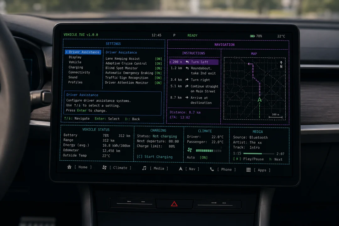
Source: anonymous community concept image. The mounted-in-dashboard photographic framing is part of what makes it useful — it shows what a fixed-envelope TUI looks like as a product surface, not as a window on a computer.
Notes / open questions for KN-86
Section titled “Notes / open questions for KN-86”- This is the closest visual analogue to KN-86’s actual situation in the whole inspiration set. PulseDeck, NetWatch, Gloomberb, Golazo are all “TUIs inside a terminal emulator inside a desktop OS.” Zork was the same on 1980 hardware. This concept is the only entry that’s the device’s UI itself. Worth re-reading whenever drafting Bare Deck Terminal or screen-design rule changes.
- Row 24 is under-specified relative to Row 0 in
screen-design-rules.md. This concept’s bottom nav bar is a strong reference for what to commit to: bracket-enclosed verb labels, optional leading glyph, partitioned action space, always visible. Worth a focused spec pass. - The “explanation box under the focused list row” pattern is a small UX win that doesn’t exist anywhere else in the inspiration set. Sub-3-row footprint, costs almost nothing, makes settings-style surfaces self-teaching. Candidate for a Bare Deck SYS-tab pattern and a cartridge-authoring UI pattern in
ui-patterns.md. - Attribution caution. Filename hash suggests Reddit / community origin. Treat the image as reference for design conversation — don’t reproduce it in pitch decks, the rendered Starlight site, or marketing material without finding and crediting (or replacing with) the original. If we want this aesthetic in a public artifact, commission a clean original rather than reusing this.