The Cyberdeck Cafe
What it is
Section titled “What it is”The Cyberdeck Cafe is the de facto community gallery for the cyberdeck-builder scene — a rolling feed of member-posted builds, “Surviving the Sprawl” lifestyle posts, build guides, and contest pages curated by Bootdsc and a small editorial circle. The header is THE CYBERDECK CAFE in neon cyan above a black background; the grid below alternates between actual cyberdecks (the mutantC, a tiny Linux laptop, an ESP32 dual-screen cyber watch, “TYPHOON,” “WELCOME BACK, JAX”) and the genre’s quietly weird connective tissue — wabi-sabi photographs of homemade rice dishes, neon-soaked street shots, painted contest backdrops. Not a single project; the vibe is the deliverable.
Aesthetic / design inspiration for KN-86
Section titled “Aesthetic / design inspiration for KN-86”- Neon-on-dark as the genre’s load-bearing color story. Across the gallery: cyan, magenta, amber, occasional acid green, all over deep black or near-black backgrounds. KN-86’s monochrome amber #E6A020 on #000000 is squarely inside this palette family — amber is one of the canonical cyberdeck accent colors, alongside cyan and magenta. The KN-86 identity isn’t a departure from the cyberdeck genre; it’s a disciplined commitment to one of its primary colors.
- Utilitarian / rugged panel design. Most cyberdecks in the gallery share a visual grammar: angular case, externally visible fasteners, integrated antenna stubs, deliberate exposure of ports, occasional cooling vents framed as design features rather than hidden. KN-86’s Pelican-1170 shell + custom 3D-printed inset panels lives in this lineage — the Pelican choice in particular reads as member of this community to anyone who’d recognize a 1170.
- Multi-screen / dashboard tendency. Many of the featured builds carry secondary displays (ESP32 dual-screen cyber watch, OLED CrOw, mutantC’s add-on modules). KN-86’s primary + CIPHER-LINE OLED auxiliary pair (Canonical Hardware Spec, ADR-0015) is the deliberate two-screen design the community already finds compelling.
- “Surviving the Sprawl” tone. The blog’s recurring motif — making things in your kitchen, eating rice from a thrifted bowl, walking under sodium lights — is the mood-board reference for how KN-86 should feel in marketing and packaging. Not Apple-minimalist, not military-grade, not maker-fair: quiet, lived-in, slightly broken-in cyberpunk. That’s the tone for marketing/marketing-plan.md and pr-faq.md.
- Member-curated, not corporate. The Cafe’s authority is sideways — the editorial voice is “we like cool stuff our friends made.” Useful as a cautionary read for KN-86 launch posture: a too-glossy launch will be culturally rejected by exactly the audience most likely to evangelize the device. Pitch with personality, not polish.
Downloaded image(s)
Section titled “Downloaded image(s)”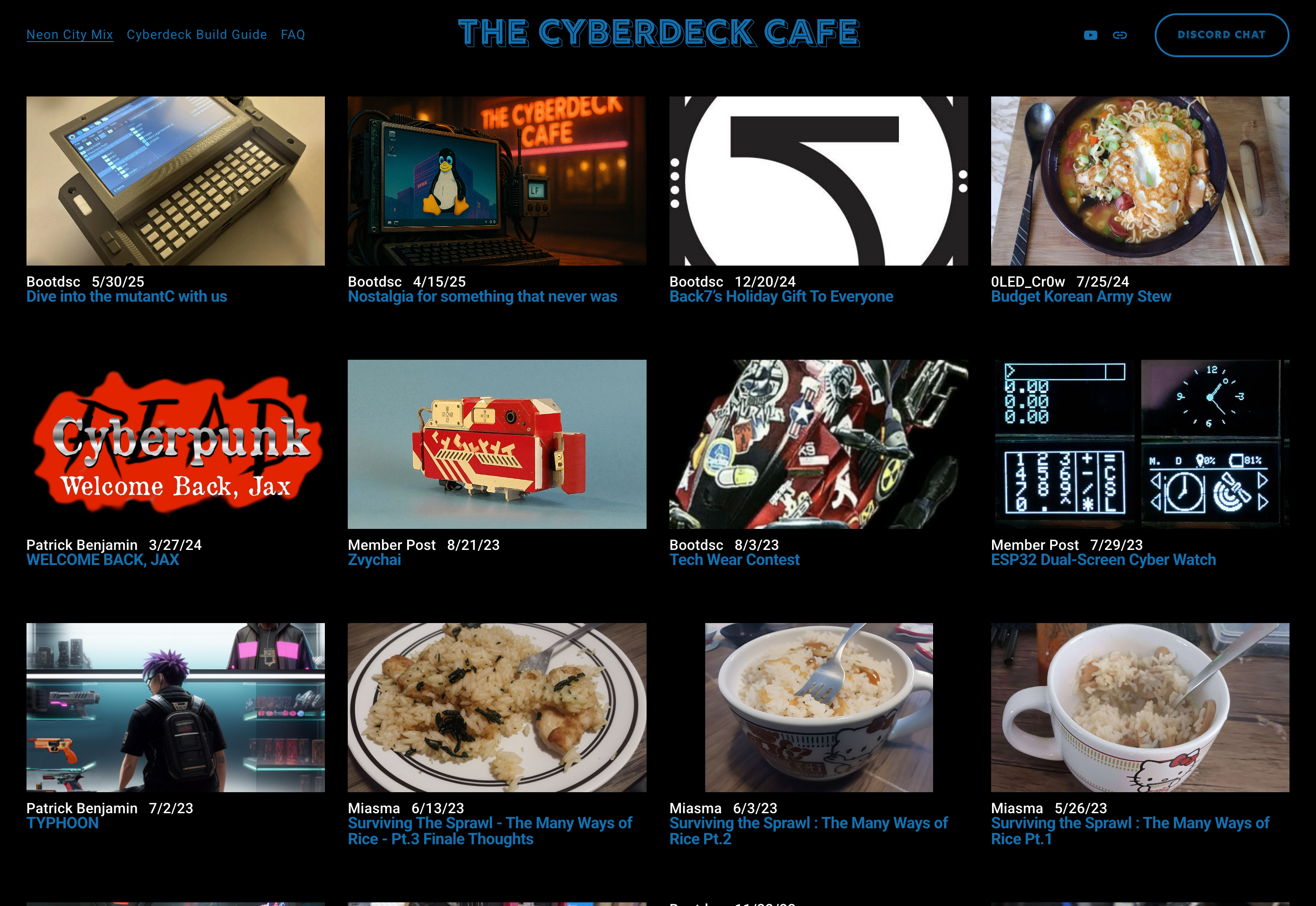
The gallery as captured 2026-06-06 — a 4-column thumbnail grid against pure black with the cyan-neon THE CYBERDECK CAFE header. The post mix on this single page covers the entire taxonomy: actual builds (mutantC, ESP32 cyber watch, OLED CrOw), narrative pieces (TYPHOON, WELCOME BACK JAX), lifestyle posts (three Surviving the Sprawl rice posts), contest pages (Tech Wear Contest), gift content (Bootdsc’s holiday gift). The mix is the message.
Notes / open questions for KN-86
Section titled “Notes / open questions for KN-86”- The KN-86 marketing tone target sits closer to the Cafe than to Penkesu. Penkesu reads as a clean DIY-laptop project; the Cafe reads as a community moodboard. KN-86 should feel like a Cafe artifact in marketing, even though the hardware build sensibility is closer to Penkesu in engineering rigor.
- Worth a KN-86 contest entry / member post when the device is real. The Cafe is exactly where the prototype reveal belongs. Park for the marketing plan.
- Amber being inside the canonical cyberdeck palette is a marketing point, not a constraint to apologize for. When prospective owners ask “why monochrome amber?” the genre answer is because it’s one of the colors the scene runs on. Cite the Cafe gallery as evidence rather than defending the choice from first principles.
- The “Surviving the Sprawl” lifestyle-piece tone is harder to imitate than it looks. It’s earned, not styled. KN-86’s CIPHER voice style guide (
docs/software/runtime/cipher-voice-style-guide.md) is the closest in-product analogue — taut, present-tense, slightly tired. Worth re-reading the Cafe’s writing alongside the style guide when authoring CIPHER fragments for the launch carts.